SOUND 360°

PROJECT TYPE

Concept: Logo Design

TOOLS

Sketchbook, Adobe Illustrator, Photoshop

PROJECT BRIEF:

As part of the 30 day logo challenge I took part in, I was tasked with creating a logo for a hardware startup that develops speakers that can map 360-degree videos onto stereo speakers for interactive events.

To achieve the goals for this project, I needed to complete the following requirements as requested by the client:

  • Needs to visually convey the Speaker’s 360-degree feature.
  • Visually represent the vastness of space and sound.
  • Will mainly be used on a black background.
  • Uses Circular Geometry design conventions to align with clients other brand assets design aesthetic.
  • Uses a font inspired by science fiction and modern sans-serif aesthetics.

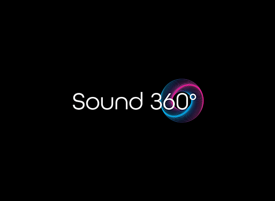
As you can see in my design, I created a logo that uses a sans-serif, science fiction vibe font with simple circular geometric graphic, to visualize not only the speakers 360-degree sound, but as well the vastness of space and sound. I also tried to convey how sound moves by giving the logo an outward swirl effect showing it expanding into the vastness the space.

I chose the colour combination of neon blue and purple to give it a futuristic feel amongst the black background as blue is often associated with the feeling of precision and purple is a very rare color in nature; some people consider it to be artificial. I chose white as the font colour to reinforce the feeling of cool, cutting edge technology, while also allowing for more visual pop on a black background.

Overall I think I achieved the goals for this project and I loved the design so much I’ve included it into my portfolio as it happens to be one of my favorite more recent designs.
“THE RANDOMS” SLO-PITCH TEAM

PROJECT TYPE

Logo Design, Sportswear

TOOLS

Sketchbook, Adobe Illustrator, Photoshop, 3rd party print service

WEBSITE

N/A

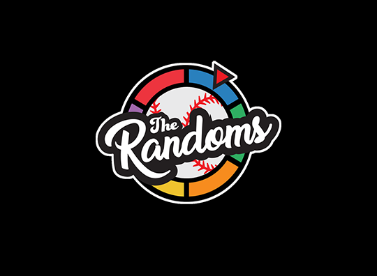
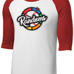
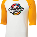
In fall 2019, due to the success of a previous team jersey design I did, I was hired to design a sports team logo for the Lloydminster “The Randoms” Slo-pitch team, who competes in various tournaments across Alberta. My clients only request was that I put emphasis on the word “Random” as their roster is an ever revolving list of players at each tournament they play.

Knowing that there is no better “spokesperson” for your team than a clever, powerful logo as it’s a great way to get noticed and reach out to supporters, sponsors, and other members of your community, I set about creating a design that not only is eye catching but provides some subtle clues to the randomness of the team.

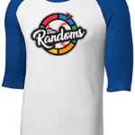
The hardest part of this project was thinking of ways to emphasize “randomness” while keeping a cohesive design aesthetic. To emphasize the rotating roster, I added a base background featuring a Baseball styled “Random Coloured Prize Wheel”, which serves to emphasize the ever changing roster the team has. In addition to that I used two different, yet complimentary script fonts to add further emphasis of the randomness of the team. To add a final touch each jersey has been designed for each player to have different coloured shoulders, to match the ones listed on the prize wheel to add final emphasis on the teams randomness.

As you can see, the finished result is a well designed logo, that achieves the clients request,  is easily recognizable, can placed on a variety of platforms, from clothes (T-shirts, ballcaps, etc) to online sources (Facebook, Instagram etc) and strongly represents the identity of the team..

Please Note: Due to the Covid-19 pandemic, this team cancelled their season before their new jerseys were printed, so unfortunately there are no photos of it being worn, but I will update this as soon as there are.